Sunday, November 7, 2010

Daft Punk Typography: Word & Image

Word and image interact together in many visual designs. In many works, words and images are juxtaposed on the same plane to communicate a message. The image of a work is used to explain the text, while the text also explains the image. In this case, words and images have purpose when the other is present. In other cases, words and images are integrated together - images are made to look like words or words are made to look like images.

For the past week of studying for midterms, typing up papers, and catching up on readings for class, I've been resorting to two things: the internet and the music of Daft Punk as a getaway from school work. While looking through people's work on Deviant Art, I stumbled upon this image.

(Image taken from deviantart.com)

I admit, I'm a Daft fanatic. Because I'm also a typography fanatic, this image just blew my mind out. Created by James Fleuraime (deviant art user name fleuraime), this typographic image titled "Technologic - Daft Punk" shows a portrait of Guy-Manuel de Homem-Christo wearing his famous helmet. Fleuraime integrates the words of the lyrics of Daft Punk's songs into the image of de Homem-Christo. With the use of various sizes of text, different colors, placement of type, etc., the portrait successfully establishes unity throughout the image. Through our gestalt perception, we initially see the portrait of de Homem-Christo as a whole, then eventually notice the individual lyrics of Daft Punk. The placement of type also established continuity in the portrait, where the line of type shows the borders of the portrait as well.

Monday, November 1, 2010

Red Bull

Midterm season at UC Davis is beginning to die down amongst most students' schedules. Rigorous amounts of coffee have been consumed in order to stay awake to retain as much information as possible before exams.


However, my roommates and I took another direction. As freshman coming from a public high school of San Francisco, we had no idea of what was coming ahead of us, what are the best study techniques - how to handle the rush of midterms in general. So, instead of using healthy study tips - sleep, balanced diet, time management - we indulged on the wonders of sugar-filled energy drinks!

One of my roommates favored Rockstars for its energizing affect. My other roommate drank Starbuck's Energy Shot for its taste. My choice of energy drinks were Red Bulls. Why? Because I am majoring in design.


Yes, the Red Bull energy drink design. After drinking Starbucks coffee for the first few weeks of the quarter, I am currently fascinated by the logo design of the Red Bull can. The contrast of the red logo against the blue and silver aluminum can, how the text fits the content of the logo, the head-to-head image of the to bulls, and most importantly, the color of the bulls: red. So many aspects of the logo's form perfectly interact with the invigorating identity of Red Bull. 


Even while taking a sip of the energy drink, the image of Red Bull strikes the eyes of the consumer. The Red Bull Company has incorporated their logo onto the tab of the can, making sure their image becomes embedded in the minds of the consumer.

Industrially Designed

Industrial design has made a tremendous impact on our everyday lives, producing mass produced products that we encounter on a daily basis. As mentioned in the documentary Objectified, such objects include vacuums, cameras, cars, and (something that we can consider as an everyday object in our modern society) the iPhone. Behind these objects, form and content work to together to create an object that can function in a person's day to day activities.

The aspects of form, content, and functionality may pass our minds as we use these objects, especially with all the technology that is involved with today's electronics. But aside from these "technological" electronics we use everyday, the aspects of form, content, and functionality passes our minds when it comes to the simplest objects. For example, the chair.


The chair is a mass produced object who's content is its functionality. A typical chair's form usually, such as this one, has four legs for support, a seat for its user, and a rest for the back. This chair, like most mass produced chairs, exhibits bilateral symmetry across a vertical axis. With this symmetry, the user has balance on the chair.


Chairs have been modified to function within an office environment. Instead of four static legs for support, wheels have bee applied for easy movement around the office. Keeping a sense of bilateral symmetry, arm rests have been added to both the left and right side of the vertical axis.


Some chairs go outside of the boundaries of a typical chair's form and content, but still functions as a chair. This accordion chair excludes legs as support, but its block-like form supports itself. Unlike the stable form of a four-legged chair or an office chair, the accordion chair can be shifted into form and still function as a chair. With the chair's accordion-like feature, the char exhibits unity through a sense of continuity from one end of the chair to the other.

Sunday, October 31, 2010

Interaction of Form and Design in Objectified

The concept of a design is an interaction between a work's form and content. Form is the visual aspect of composition, structure, and the work as a whole, while content is the work's subject matter, story, or information that the artist communicates to the viewer. Without content, the design's form stands alone without any purpose. Without form, the design's content cannot be effectively conveyed to its audience.

Throughout the documentary Objectified, director Gary Hustwit explores objects that modern society encounters everyday, such as chairs, cars, toothpicks...just a few to mention. One of the ongoing themes within the documentary is the interaction of form and content within the design of each object. One object that the film focused on was the vacuum, examining the form and content of three different modern vacuums.


With the Dyson vacuum designed by James Dyson, the form of the vacuum fits the content of its design: the handle on the top, suction on the bottom, movement by wheels. Basically, the Dyson vacuum's form fits the concept of a typical vacuum.


Another vacuum examined within the film was the Dirt Devil KONE, designed by Karim Rashid. By looking at the KONE's form, the content of the design is very unclear. Karim designed the vacuum to function as a piece of art while being a common household item. However, the vacuum fits more towards its art aspect rather than its vacuum aspect, having its viewers question if the KONE is even a vacuum at all.


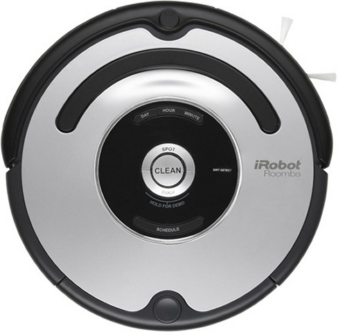
The Roomba vacuum, the last vacuum examined in the film, functions by itself without any human interaction. Because of this, the Roomba's content deviates from that of a typical vacuum.

As mentioned in the film, "We now have a new generation of products, where the forms bear absolutely no relation to the function." The interaction of form and content within the modern objects of the film has  taken a new conversation as technology and design evolved over time. The "tangible content" of original designs have turned "intangible" as the object's design has been innovated over time.

Monday, October 18, 2010

Comparison and Contrast: Gap Logo Redesign

Last week in Introduction to Design, Professor Housefield recommended at the daily news for topics to blog about. One of his examples of design in the news is Gap's logo redesign.

Like the Startbucks' logo I mentioned in my earlier post, the comparing and contrasting of the old design and the new design is great a discussion when it comes to logo redesigns. Receiving negative remarks by design critics everywhere, Gap's logo redesign is worthy of comparing and contrasting.

Let's take a look at the two Gap logos:


Gap's former logo (right) displays the company's name within a dark navy blue box. With the use of serifs in the logo's type, the former logo gave the company a sense of sophistication to their clothing line, especially for their well known line of jeans. The contrast of light type on top of a dark form also makes the company's name stand out (as well as the company itself).

Gap's new logo (left) presented itself to the public last week. In the new logo design, the company's name has been changed into a Helvetica typeface, removing their "sophisticated" use of serifs. The well known blue box that encased the company's name has been reduced and placed in the corner of the new logo. Also, the blue box now exhibits a diagonal gradient in contrast to their former solid navy blue box. For its bland use of the font type Helvetica and the reduction of its prominent blue box, Gap's new logo has been slammed by logo designers, said to have taken a step back from their former logo.

Within its day of appearance in the news, the new Gap logo has been withdrawn from the public. 

Design as Conversation


As defined by Dictionary.com, a conversation is an "informal interchange of thoughts, information, etc., by spoken words." Design - as common as it sounds - can be considered a conversation.

By now, we have grown to know the concepts of "design is everything" and "design is everywhere." With something that exists everywhere, we as human beings have been affected by many aspects of design throughout our lives. We are even affected by design on a daily basis, from the form of the office chair you are sitting on, to the structure of the car outside your building, to the colors and shapes of the traffic signs that pass by you as you drive home from work. With this much impact from something we encounter everyday, we can even say that design has a life of its own.

Everyday we have a conversation with the design of the world around us, having an "informal interchange of thought, information, etc." The layout of our keyboards makes us wonder why the letters are not in alphabetical order. The first three minutes of the Jeunet's 2001 film Amélie provides us indirect information on the plot to come. Although design communicates with us indirectly, it gives us thoughts of how things are they way they are and information on why things are the way they are. As we communicate with design, we engage with what is around us, interchanging with what design has to offer our minds.

Still not convinced that design can be considered a conversation? For those who think so, your opinion is valid: Again, as defined by Dictionary.com, a conversation is an "informal interchange of thoughts, information, etc., by spoken word." There are probably some situations in design where we can actually exchange spoken word with design itself, but for most aspects of design like visual communications and fine art, this interchange of spoken word is absent. We cannot simply talk to Da Vinci's Mona Lisa and expect a response from her. However, the closest thing we can get to spoken word from design such as visual communications and fine art is the visual display of words. In Understanding Comics: The Invisible Art, Scott McCloud describes words as a form of design, being the "ultimate abstraction" of reality while retaining a meaning within a word itself. With the use of words in visual design and fine art, the design of images can be accompanied by the use of words, being able to communicate - or have an "interchange of thought and information" - with human society.

Whether design in society interchanges thoughts and ideas with our minds indirectly, or through the use of words and visuals to exhibit information, design is in a constant conversation with those that are surrounded by it.

*Image source: http://www.conversationagent.com/2007/12/index.html

Pixel - The Graphic Design Club

There are many types of people within the design of our society - architects, interior designers, engineers, fashion designers - the list could go on and on. A good portion of design in our society is also visual communications, conveying visible information to the world. Within this realm of visual communications, an important aspect of the people of design are graphic designers.

I recently attended the first general meeting of Pixel, an AIGA student group in UC Davis specifically about graphic design and visual communications. The club consists of students associated with visual communications (and other students of other affiliations - everyone is welcome!), and is a great resource for design students at UC Davis, providing many events and job opportunities for members.

Being a mere first-year student here at UC Davis, I wanted to be involved in many clubs that spark my interest as I did in my years in high-school. Ever since Pixel made an announcement during a lecture in Introduction to Design, I have been forward to their first general meeting. As a design major and an aspiring graphic designer, I was hoping for Pixel to give an outline of the design courses that UC Davis has to offer.

(Photo by Me, Daniel Daquigan)

And that's what Pixel did. President Dayee Leung and vice president Leslie Cheng, along with the rest of Pixel's officers, provided the meeting with a list of various design courses, such as Introduction to Photography and Letterforms & Typography. Showing students a preview of these design classes, Pixel helps students prepare for upcoming quarters while keeping them interested in taking these classes as well.