Sunday, October 31, 2010

Interaction of Form and Design in Objectified

The concept of a design is an interaction between a work's form and content. Form is the visual aspect of composition, structure, and the work as a whole, while content is the work's subject matter, story, or information that the artist communicates to the viewer. Without content, the design's form stands alone without any purpose. Without form, the design's content cannot be effectively conveyed to its audience.

Throughout the documentary Objectified, director Gary Hustwit explores objects that modern society encounters everyday, such as chairs, cars, toothpicks...just a few to mention. One of the ongoing themes within the documentary is the interaction of form and content within the design of each object. One object that the film focused on was the vacuum, examining the form and content of three different modern vacuums.


With the Dyson vacuum designed by James Dyson, the form of the vacuum fits the content of its design: the handle on the top, suction on the bottom, movement by wheels. Basically, the Dyson vacuum's form fits the concept of a typical vacuum.


Another vacuum examined within the film was the Dirt Devil KONE, designed by Karim Rashid. By looking at the KONE's form, the content of the design is very unclear. Karim designed the vacuum to function as a piece of art while being a common household item. However, the vacuum fits more towards its art aspect rather than its vacuum aspect, having its viewers question if the KONE is even a vacuum at all.


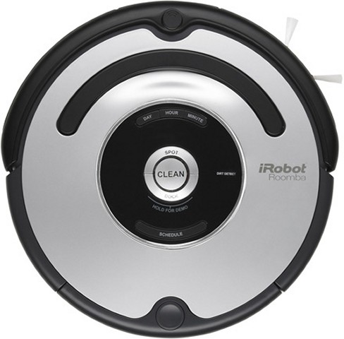
The Roomba vacuum, the last vacuum examined in the film, functions by itself without any human interaction. Because of this, the Roomba's content deviates from that of a typical vacuum.

As mentioned in the film, "We now have a new generation of products, where the forms bear absolutely no relation to the function." The interaction of form and content within the modern objects of the film has  taken a new conversation as technology and design evolved over time. The "tangible content" of original designs have turned "intangible" as the object's design has been innovated over time.

Monday, October 18, 2010

Comparison and Contrast: Gap Logo Redesign

Last week in Introduction to Design, Professor Housefield recommended at the daily news for topics to blog about. One of his examples of design in the news is Gap's logo redesign.

Like the Startbucks' logo I mentioned in my earlier post, the comparing and contrasting of the old design and the new design is great a discussion when it comes to logo redesigns. Receiving negative remarks by design critics everywhere, Gap's logo redesign is worthy of comparing and contrasting.

Let's take a look at the two Gap logos:


Gap's former logo (right) displays the company's name within a dark navy blue box. With the use of serifs in the logo's type, the former logo gave the company a sense of sophistication to their clothing line, especially for their well known line of jeans. The contrast of light type on top of a dark form also makes the company's name stand out (as well as the company itself).

Gap's new logo (left) presented itself to the public last week. In the new logo design, the company's name has been changed into a Helvetica typeface, removing their "sophisticated" use of serifs. The well known blue box that encased the company's name has been reduced and placed in the corner of the new logo. Also, the blue box now exhibits a diagonal gradient in contrast to their former solid navy blue box. For its bland use of the font type Helvetica and the reduction of its prominent blue box, Gap's new logo has been slammed by logo designers, said to have taken a step back from their former logo.

Within its day of appearance in the news, the new Gap logo has been withdrawn from the public. 

Design as Conversation


As defined by Dictionary.com, a conversation is an "informal interchange of thoughts, information, etc., by spoken words." Design - as common as it sounds - can be considered a conversation.

By now, we have grown to know the concepts of "design is everything" and "design is everywhere." With something that exists everywhere, we as human beings have been affected by many aspects of design throughout our lives. We are even affected by design on a daily basis, from the form of the office chair you are sitting on, to the structure of the car outside your building, to the colors and shapes of the traffic signs that pass by you as you drive home from work. With this much impact from something we encounter everyday, we can even say that design has a life of its own.

Everyday we have a conversation with the design of the world around us, having an "informal interchange of thought, information, etc." The layout of our keyboards makes us wonder why the letters are not in alphabetical order. The first three minutes of the Jeunet's 2001 film Amélie provides us indirect information on the plot to come. Although design communicates with us indirectly, it gives us thoughts of how things are they way they are and information on why things are the way they are. As we communicate with design, we engage with what is around us, interchanging with what design has to offer our minds.

Still not convinced that design can be considered a conversation? For those who think so, your opinion is valid: Again, as defined by Dictionary.com, a conversation is an "informal interchange of thoughts, information, etc., by spoken word." There are probably some situations in design where we can actually exchange spoken word with design itself, but for most aspects of design like visual communications and fine art, this interchange of spoken word is absent. We cannot simply talk to Da Vinci's Mona Lisa and expect a response from her. However, the closest thing we can get to spoken word from design such as visual communications and fine art is the visual display of words. In Understanding Comics: The Invisible Art, Scott McCloud describes words as a form of design, being the "ultimate abstraction" of reality while retaining a meaning within a word itself. With the use of words in visual design and fine art, the design of images can be accompanied by the use of words, being able to communicate - or have an "interchange of thought and information" - with human society.

Whether design in society interchanges thoughts and ideas with our minds indirectly, or through the use of words and visuals to exhibit information, design is in a constant conversation with those that are surrounded by it.

*Image source: http://www.conversationagent.com/2007/12/index.html

Pixel - The Graphic Design Club

There are many types of people within the design of our society - architects, interior designers, engineers, fashion designers - the list could go on and on. A good portion of design in our society is also visual communications, conveying visible information to the world. Within this realm of visual communications, an important aspect of the people of design are graphic designers.

I recently attended the first general meeting of Pixel, an AIGA student group in UC Davis specifically about graphic design and visual communications. The club consists of students associated with visual communications (and other students of other affiliations - everyone is welcome!), and is a great resource for design students at UC Davis, providing many events and job opportunities for members.

Being a mere first-year student here at UC Davis, I wanted to be involved in many clubs that spark my interest as I did in my years in high-school. Ever since Pixel made an announcement during a lecture in Introduction to Design, I have been forward to their first general meeting. As a design major and an aspiring graphic designer, I was hoping for Pixel to give an outline of the design courses that UC Davis has to offer.

(Photo by Me, Daniel Daquigan)

And that's what Pixel did. President Dayee Leung and vice president Leslie Cheng, along with the rest of Pixel's officers, provided the meeting with a list of various design courses, such as Introduction to Photography and Letterforms & Typography. Showing students a preview of these design classes, Pixel helps students prepare for upcoming quarters while keeping them interested in taking these classes as well.

Monday, October 11, 2010

Yaan Tiersen: The Design of Amélie

It was the first lecture of the quarter in Introduction to Design. As I walk down the stairs of the lecture hall of Haring, I notice students seated looking at the projector screen. I take a seat and join my fellow design students by looking at the screen as well. I couldn't believe my eyes. Professor Housefield is showing Amélie on the first day of class.


I have only watched Amélie once in my lifetime, at a free screening of the movie at Dolores Park in San Francisco. I was with my extended family sitting on the grass in front of the projector screen. As a public showing of Amélie, hundreds of San Franciscans surrounded me staring at the same screen. It was hard to hear the dialogue between Amélie and the various characters with this many people conversing around you. Aside from hearing people's opinions on the San Francisco Giants, one thing about Amélie was the movie's music.


Going back to the first day of Introduction to Design, Professor Housefield asked us to take notice of the design of the first three minutes of the film Amélie. The design of these three minutes - contrasting colors of red and green, the time lapsing of the various scenes, its subtle tones - were used to reveal  content of the rest of the film. Like my first experience of watching Amélie, what stood out to me the most during these first three minutes was its music. The song playing within these first three minutes is titled "Comptine D'un Autre Eté, L'aprés-Midi." Yann Tiersen, who composed this song, also produced the rest of the soundtrack of Amélie. Mainly composed of piano and accordion, the music of Amélie gives the overall design of the movie an somber, yet playful, tone, much like Amélie's character.

Creativity from Without

Creativity from without, or finding inspiration from outside yourself. 

Two months ago, a few of my cousins and I started on our self-made Christmas gift for this year. We decided to make a calendar using photos that we will take ourselves using our Canon camera. For the calendar's theme, we chose to look at the surroundings of our hometown: San Francisco.

(Image by Me, Daniel Daquigan)

After assigning places like the Golden Gate Bridge or AT&T Park to each month, we noticed that we had too many well-known places - places that San Francisco is obviously known for. We wanted to show people places within San Francisco that makes the city a secret gem - places that gives locals the beauty and advantage of living within the city limits. 

After driving around the city, we stumbled upon this land structure along the Golden Gate Yacht Club:

(Image by Me, Daniel Daquigan)


This compilation of cement an pipes is known as the wave organ. As an exhibit of the San Francisco Exploratorium, the concept of the wave organ was developed by Peter Richards and put together by George Gonzalez. With this concept, Richards and Gonzalez looked "from without" and uses the San Francisco Bay for inspiration. As waves from the San Francisco Bay hit the metal pipes that are embedded in the cement, the openings of each pipe producing wave sounds, or what San Franciscans call "ocean music." 

Whether we're using landmarks around the neighborhoods of San Francisco or using the sounds of the Bay, the city is a great source of inspiration "from without."

Stone Soup

Last week in Introduction to Design, we had our first creative group collaboration in which Professor Housefield calls Stone Soup. 
(Source: Stone Soup, Illustrations by Marcia Brown)

In the old folk tale Stone Soup, three travelers convince a town of greedy villagers to contribute to the making of a pot of soup that, by the end of the tale, was enjoyed by all. Similar to this folk tale, individuals of each group brought materials to class, mostly materials that were simply lying around within their homes and dorm rooms, and contributed to the group's creative output to make their own "stone soup."

Compared to other groups, my group seemed to be low on the quality of our materials, bringing two pieces of cardboard, a tissue box, an empty Simply Orange bottle, a few tubes of paint, newspaper, hair ties, and a toy stuffed rabbit. Doesn't seem like much, does it? I mean, we're supposed to be creating something amazing from these materials, something that is worthy of being called Stone Soup, something that Housefield can look at and say "Wow, these students deserve to be design students," but what were we supposed to do with materials like this? For some people, this feeling of being limited may be the case.

For a group of design students, there is always unlimited possibilities in creativity, even with a set of materials like this. We weren't just limited with these materials either. As an outdoor assignment, we were surrounded by nature, giving us materials like the trees, the leaves, or even the pavement. With our set of low budget materials, nature, and our creativity, we set out to make our own Stone Soup.

(Image by Me, Daniel Daquigan)

Going back to my first blog post, "Design is everywhere." As design students, we found design in the materials that we contributed to our soups, we found design in the nature that surrounded us, and we found design in our group members, each of us contributing our creativity in the process of cooking up our creations.

Monday, October 4, 2010

Starbucks Coffee

It's was Sunday. Everyone on Thompson Housing Building was settling down at the end of loaded weekend. I begin to cram in my homework that is due for the following day. After mindlessly passing through a few readings, I realized that I cannot continue my homework with only 5 hours of drifting in and out of sleep. So why not better the situation with a Grande Caramel Macchiato from the the world's biggest coffeehouse company?

(Image by me, Daniel Daquigan)

Starbucks Coffee has become a world renown symbol of the twenty first century. And many college students in the United States turn to it as fuel for the day's tasks. The world grabs this cup on a daily basis, passing through the day without realizing the icon that rests in their hand with every sip of coffee. The famous green icon on each Starbucks cup is a product of logo design that has gone through many transformations, as all logos do. With all the changes that the Starbucks logo went through, many people cannot make out the what exactly is in the center of the well-known trademark. From the mere image, we can at least make out that there is a woman wearing some sort of crown. But, again, what exactly is this woman? A Starbucks Princess? A queen of coffee?

Undergoing multiple redesigns, the Starbucks trademark started off as a logo similar to its present-day logo.

Originally brown, the first Starbucks logo features a complete image of the woman present in its current logo. But by looking at the original design, the woman is shown to be a two-tailed mermaid. The Starbucks logo depicts a siren, an enchanting female figure that seductively lures seafarers, according to Greek mythology. With such a symbol, Starbucks uses the image of the siren to represent their coffee as irresistible and high in quality.

The design of every logo has some sort of meaning behind its portrayal. With Sunday's Starbucks cup now pinned to the wall behind my desk as I write this post, I look at the two-tailed siren that faces me and continue to become infatuated with the meaning and the design of the Starbucks logo.

(Image by me, Daniel Daquigan)

Sunday, October 3, 2010

"Understanding Comics: The Invisible Art" by Scott McCloud - An Overview

For those in Introduction to Design, you all have encountered one of our required readings for the class, Understanding Comics: The Invisible Art by Scott McCloud.

(Image by Me, Daniel Daquigan)

For those who haven't (which I hope is not the case), you are truly missing out a great read. The reading goes into depth on the subject of comics: from the history of comics, going as far back as 3,000 years, to the anatomy of comics, to the concepts of picture and word, the path of creating a work, and everything else comic related.

What makes the reading a standout is the overall design of the book. Unlike a typical textbook for other classes - hardcover, bulky, tedious, strictly text, etc. - Understanding Comics: The Invisible Art takes on a different direction. McCloud applies the information he has to offer about comics in the form of a comic book itself. He takes on the basic form of all comics that most of us have encountered, using panels, talk bubbles, and illustrations to convey his knowledge of comics. Even with this basic form, McCloud is able to appeal to the reader's senses as well.


In Chapter 5 of the text, titled Living In Line, McCloud asks the reader "Can emotions be made visible?" (McCloud, pp. 118), showing a sequence of illustrations that convey a mental state, such as joy and anger.

(Image by Me, Daniel Daquigan)

By showing different applications of lines, Understanding Comics: The Invisible Art fully engages with the reader's senses within only a few pages.

The book's illustrations are a great complement to all of the main points McCloud successfully comes across. Everything about the book's design - from it's general layout, to the way McCloud incorporates himself into the text as a animated character - helps the book exceed substantially past its purpose of informing readers about comics.

Sources:
Understanding Comics: The Invisible Art by Scott McCloud

Paper Santa Claus: My "Firsts" to Design


As said repetitively to everyone in Professor Housefield's Introduction to Design class in Haring Hall, "Design is everywhere." It has been surrounding us since our first experiences as infants. It surrounds as we currently skim through multiple posts on Blogger. It will continue to surround us even if we grow older and our perception wares off. But before we start to experience the "magic of design" throughout the rest of our lives, we all have that beginning moment early in our lives that starts making us aware of the design that exists around us.

My earliest memories of the impact of design in my life occurred when I was in Kindergarten. One of our assignments was an arts and crafts project that requires us to make a paper cutout of Santa Claus using construction paper. It was the type of project where the teacher has already set black lines on the construction paper as guidelines for cutting using those tiny safety scissors with our eager little hands. The teacher also set out other supplies for us to use: black buttons for Santa's coat, cotton balls for for his jolly beard, blue sequins for his Aryan eyes, and Elmer's liquid glue to hold our Santa creations together in one piece.

After the teachers tells us the directions, I set out to create. Each of the components - his circular belly, the sparkling eyes, his soft cotton beard, the hard coat buttons - were compiled together. The assignment and the directions that the teacher required us to follow caused all these components - which may have no meaning separately - to combine and fulfill this design that is known to be a simplified two-dimensional version of Santa Claus for mere Kindergarteners.

As the little Kindergartener I was at the time, I was simply amazed at what I had made: my own Santa Claus. Going back to this memory of mine, I remind myself that while design is everywhere and is everything, design is also something that we can create. It could be something we create based on an assignment or something we can create without even noticing.